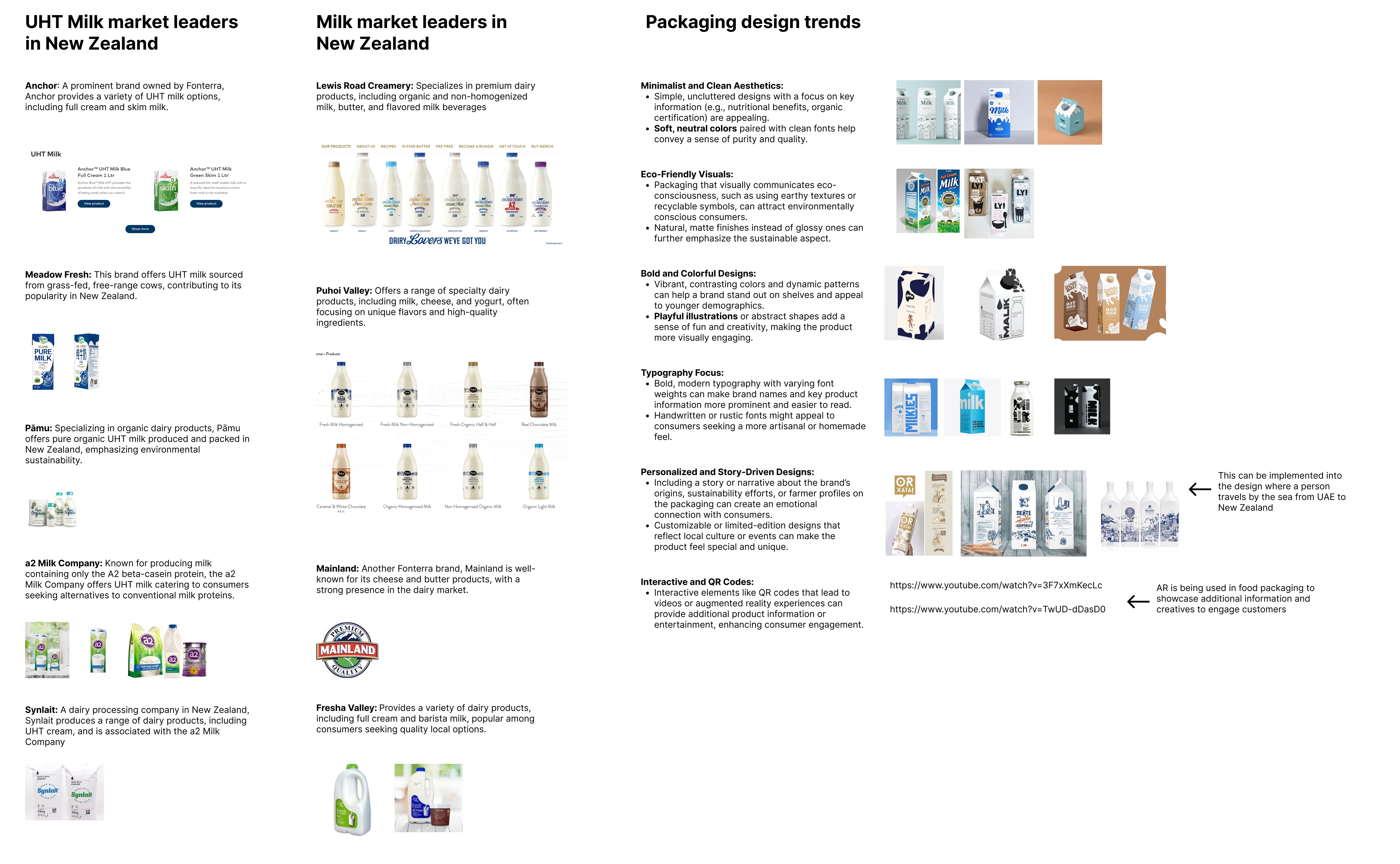
Over the next few weeks, six distinct brand concepts came to life - each telling a different story. All concepts maintained a minimalist character, some were more stylized, while others were rich in detail. Our Miro board quickly became a living, breathing ecosystem of sketches, moodboards, and experimental visuals.
I illustrated every concept, ensuring the storytelling was rich and authentic. Meanwhile, our in-house 3D team sculpted a photorealistic hero: an eco-friendly milk bottle designed to feel modern, tactile, and premium. Also, we made different versions of logo, which were representing milk in different ways.
Over the next few weeks, six distinct brand concepts came to life - each telling a different story. All concepts maintained a minimalist character, some were more stylized, while others were rich in detail. Our Miro board quickly became a living, breathing ecosystem of sketches, moodboards, and experimental visuals.
I illustrated every concept, ensuring the storytelling was rich and authentic. Meanwhile, our in-house 3D team sculpted a photorealistic hero: an eco-friendly milk bottle designed to feel modern, tactile, and premium. Also, we made different versions of logo, which were representing milk in different ways.
Over the next few weeks, six distinct brand concepts came to life - each telling a different story. All concepts maintained a minimalist character, some were more stylized, while others were rich in detail. Our Miro board quickly became a living, breathing ecosystem of sketches, moodboards, and experimental visuals.
I illustrated every concept, ensuring the storytelling was rich and authentic. Meanwhile, our in-house 3D team sculpted a photorealistic hero: an eco-friendly milk bottle designed to feel modern, tactile, and premium. Also, we made different versions of logo, which were representing milk in different ways.
Over the next few weeks, six distinct brand concepts came to life - each telling a different story. All concepts maintained a minimalist character, some were more stylized, while others were rich in detail. Our Miro board quickly became a living, breathing ecosystem of sketches, moodboards, and experimental visuals.
I illustrated every concept, ensuring the storytelling was rich and authentic. Meanwhile, our in-house 3D team sculpted a photorealistic hero: an eco-friendly milk bottle designed to feel modern, tactile, and premium. Also, we made different versions of logo, which were representing milk in different ways.
Finally, I came to a solution: a custom illustration stretching across four bottles side by side. Suddenly, a single SKU became a billboard in the fridge - impossible to ignore.
The result
The chosen direction balanced a clean, minimalist look with subtle warmth - designed to stand out in the chilled aisle while staying true to the brand’s natural roots.The client praised not only the final result, but the process - the cultural research, the strategic depth, and the way we delivered it.
If you’re looking for a creative partner who understands both the science and the shelf, we’re ready to help.
Over the next few weeks, six distinct brand concepts came to life - each telling a different story. All concepts maintained a minimalist character, some were more stylized, while others were rich in detail. Our Miro board quickly became a living, breathing ecosystem of sketches, moodboards, and experimental visuals.
I illustrated every concept, ensuring the storytelling was rich and authentic. Meanwhile, our in-house 3D team sculpted a photorealistic hero: an eco-friendly milk bottle designed to feel modern, tactile, and premium. Also, we made different versions of logo, which were representing milk in different ways.
Finally, I came to a solution: a custom illustration stretching across four bottles side by side. Suddenly, a single SKU became a billboard in the fridge - impossible to ignore.
The result
The chosen direction balanced a clean, minimalist look with subtle warmth - designed to stand out in the chilled aisle while staying true to the brand’s natural roots.The client praised not only the final result, but the process - the cultural research, the strategic depth, and the way we delivered it.
If you’re looking for a creative partner who understands both the science and the shelf, we’re ready to help.
Over the next few weeks, six distinct brand concepts came to life - each telling a different story. All concepts maintained a minimalist character, some were more stylized, while others were rich in detail. Our Miro board quickly became a living, breathing ecosystem of sketches, moodboards, and experimental visuals.
I illustrated every concept, ensuring the storytelling was rich and authentic. Meanwhile, our in-house 3D team sculpted a photorealistic hero: an eco-friendly milk bottle designed to feel modern, tactile, and premium. Also, we made different versions of logo, which were representing milk in different ways.
Finally, I came to a solution: a custom illustration stretching across four bottles side by side. Suddenly, a single SKU became a billboard in the fridge - impossible to ignore.
The result
The chosen direction balanced a clean, minimalist look with subtle warmth - designed to stand out in the chilled aisle while staying true to the brand’s natural roots.The client praised not only the final result, but the process - the cultural research, the strategic depth, and the way we delivered it.
If you’re looking for a creative partner who understands both the science and the shelf, we’re ready to help.